The task was to make a corporate identity for the existing technopark, with the previously selected name.
Services:
Branding
Branding
Client:
NAPA
NAPA
Year:
2022
2022
Concept
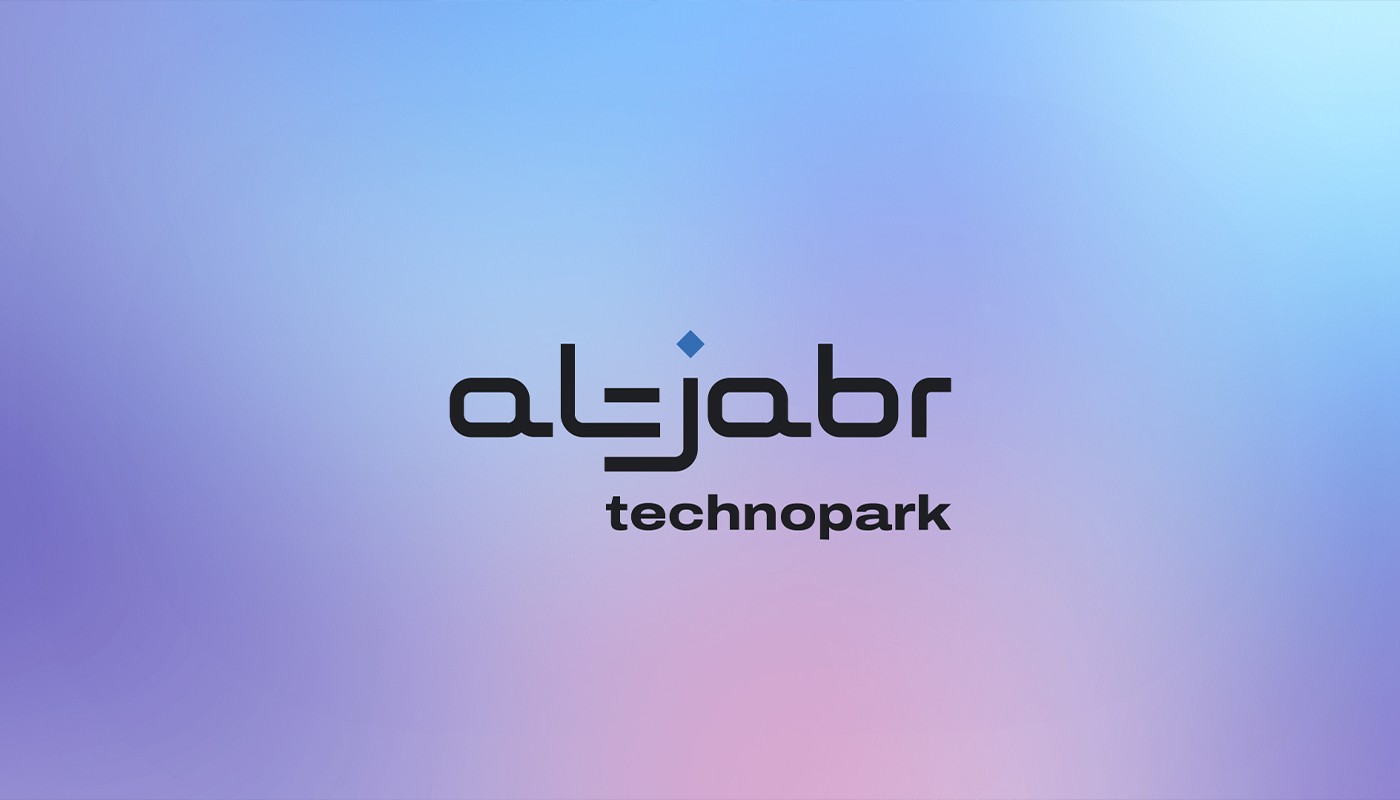
The name AL-JABR is translated from Arabic as replenishment, algebra in Russian. The technopark is designed to create a hub for young professionals who will train on the internal IT platform, create startups and promote them in the local and international arena.
Scope
Since the name comes from Arabic, we added an Arabic ligature motif to the font of the logo. Also, the logo itself consists of several stylizing elements. The connection of the letters L, dash and J form a server-like element, the letters L and J themselves are the directional cables, and the point above the letter j is an indicator that shows the presence or absence of contact.
Concept
The name AL-JABR is translated from Arabic as replenishment, algebra in Russian. The technopark is designed to create a hub for young professionals who will train on the internal IT platform, create startups and promote them in the local and international arena.
Scope
Since the name comes from Arabic, we added an Arabic ligature motif to the font of the logo. Also, the logo itself consists of several stylizing elements. The connection of the letters L, dash and J form a server-like element, the letters L and J themselves are the directional cables, and the point above the letter j is an indicator that shows the presence or absence of contact.